The design of the app, show screen shots on how i made it. Also show screen shots of app in use.
Finding out my research on how apps icons look like, and what works well, and what doesn't I started coming up with my own ideas. Analysing my ideas, and seeing how I would create my own app icons, I have come to he point of the designs, and here they are:

My first design, was concentrated on the different colours, and trying to show the most simplistic and easy to read icons that the public would understand. I have added an effect to all the icons to show that they are in a pack, and from the same designer. I think this is a good idea, as this makes the icon interesting, and noticeable. I think the small effect, gives the icon a shine to it, and looks really effective to the image. I also like that I have darkened the colour and faded this out to the background colour. While I was looking thought the research I found the most are curved edges, so I designed mine to have curved edges as well, as I think this look more like a icon for an app. I think the colours I choose for my seven icons are good, as they are not to similar to each other, so that the public may get confused with the applications, although they are very bright and will stand out, from other icons. I think in some of the icons I have given too much information which could be removed, for example the pedometer, and the temperature application.
I created these using Illustrator, and Photoshop. I first used illustrator to create the icon, then moved this into Photoshop to edit the colours and the background. The coloured layers were separate to the icon design, so I could change the colour for each icon.

Here is my second design, with this design I have done a slight change to the design, I have added another effect to the icon so that this would look slightly more attractive when in the apps list on any website. For the first app icon I have removed the number, just to show you what I have changed. I added a polorize effect to the icons, which fives slight lines inside the icon. You can see this effect easier on some than other icons, due to this reason I will not use this design fro my final piece. How I added this little effect was using the Posterize effect after adding the coloured layers, and designs. I went Image > Adjustments > Posterize. This would bring the window shown below, and I would adjust the bar which would effect the the icons. I chose 17 percent, as anymore make the effect show to much.


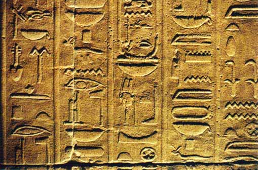
To the left is the third design. I again changed the colour as I was experimenting, and linking this with the research. I was linking this design to this image from my research. I kept with the posterize effect, as this would show up a lot more easier against the white background. I have also keep an effect that has created a black fade round the edge. The posterize effect adds to this, and works really well, although due to the original colour the posterize effect has shown up more against the white than others. I still think that this works really well, and looks better than the second design.

I created a complete new design, trying to create a modern look on the app designs. I thought that if a modern look to the app icon would attract more customers, as this more and more design are starting to change the look of design. Another massive change I have done from the first couple of designs is that they are a lot more simplistic. They have very simple icons on the front, showing what the app is about. I have tried to design them in a way that it is easy to read quickly, and to understand that they mean.
I went with a black and white effect colour as I thought that this looks more stylish, and interesting. I added a light colour effect over the top at the bottom of each icon. You can see that slight lightened colour change, I think this adds to the icon to standout. Many other icons have similar effect like this, although I designed mine to be at an angle to be different. I like this effect because this changes every colour in the icon, for example the pedometer, and the temperature apps, the icon clearly shows this.
The wind app icon, I found difficult to think of a design, although I think this was the best symbol to do, as this is simple and easy to read. I think the only thing what could be wrong with this icon is that people may mistake it for water, or the ocean, also the speedometer, and the pressure apps are too similar. The public may also get confessed with these icons. I think I will change the pressure icon, so this is easier to understand. My favourite icon would be the height application, as I think this is simple, although attractive. I think the white and black colour works very well with this icon.

Here is the changes that I have done to the first version of this design. I found changing the pressure application was very difficult as this was hard to design a simple icon. I thin the design I have changed it to, is easier to understand, and read, although I still think this could confuse some of the public, although on a website, they usually write what the application is underneath the icon. I have also changed the wind application, as in the previous version the public could easy misunderstand the icon and think that this was something to do with water or the ocean. I think this will be my final icons, as I like the style. I think this fits in well with the style of design at the moment. This looks neat, futuristic, and modern. I like the effect added to the the design as I think this brings out the icons, and looks attractive.
Here is the application in action. I choose the speed application as I could see this very clearly in action. I choose to use a Iphone to show the application in use. I have shown two images that how you the idea of how the application works.


I choose this design during the action of the application because I thought this looked neat, and stylish, although simple and easy, quickly to read. I chose not to go in detail on the dial, as the speed is shown digitally, although the hand does move round depending on the speed you are going. The transition from one speed to the other is a fade effect. The effect is fast, so if your accelerating quickly the application can keep up, and the user can read the information easily.